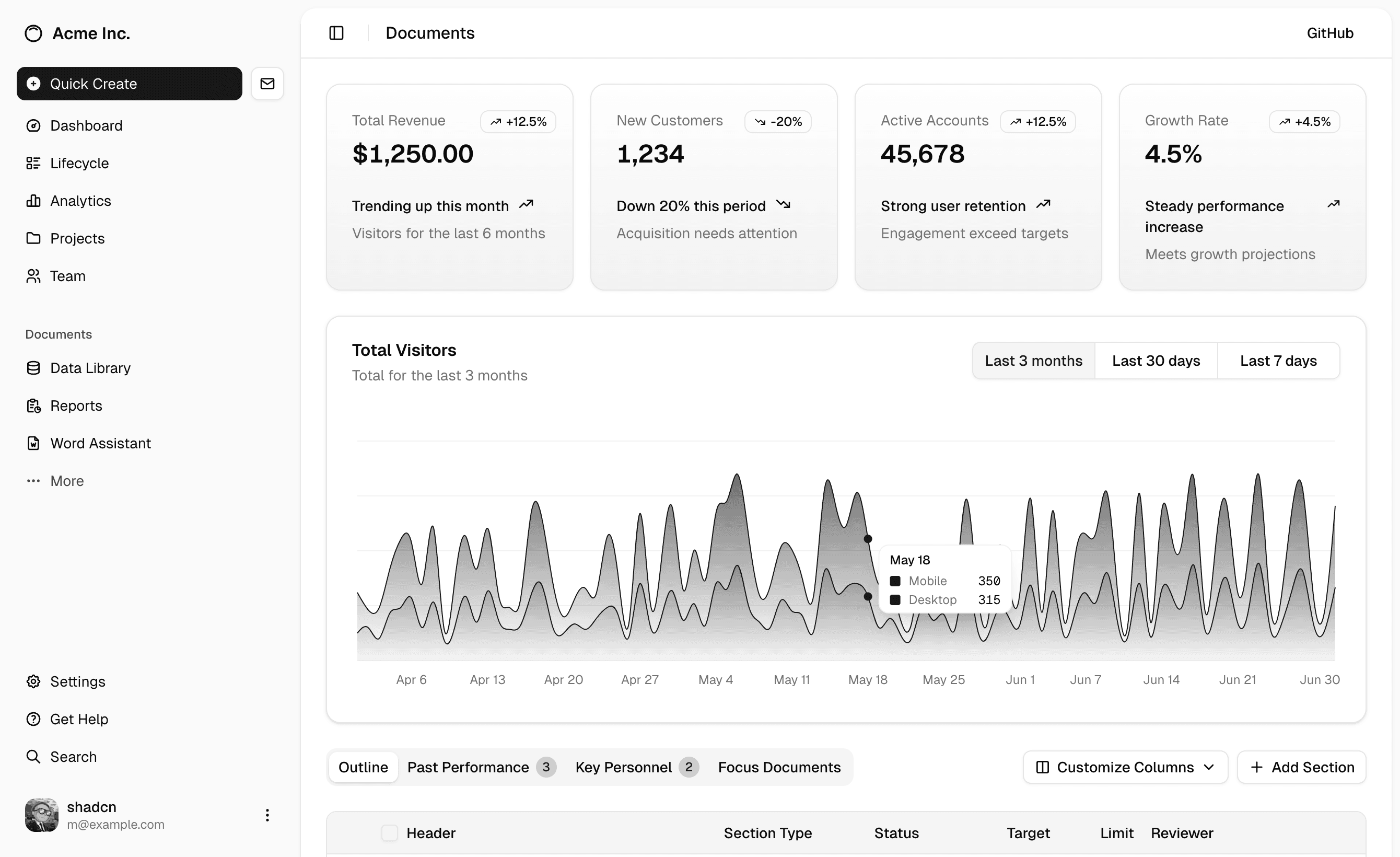
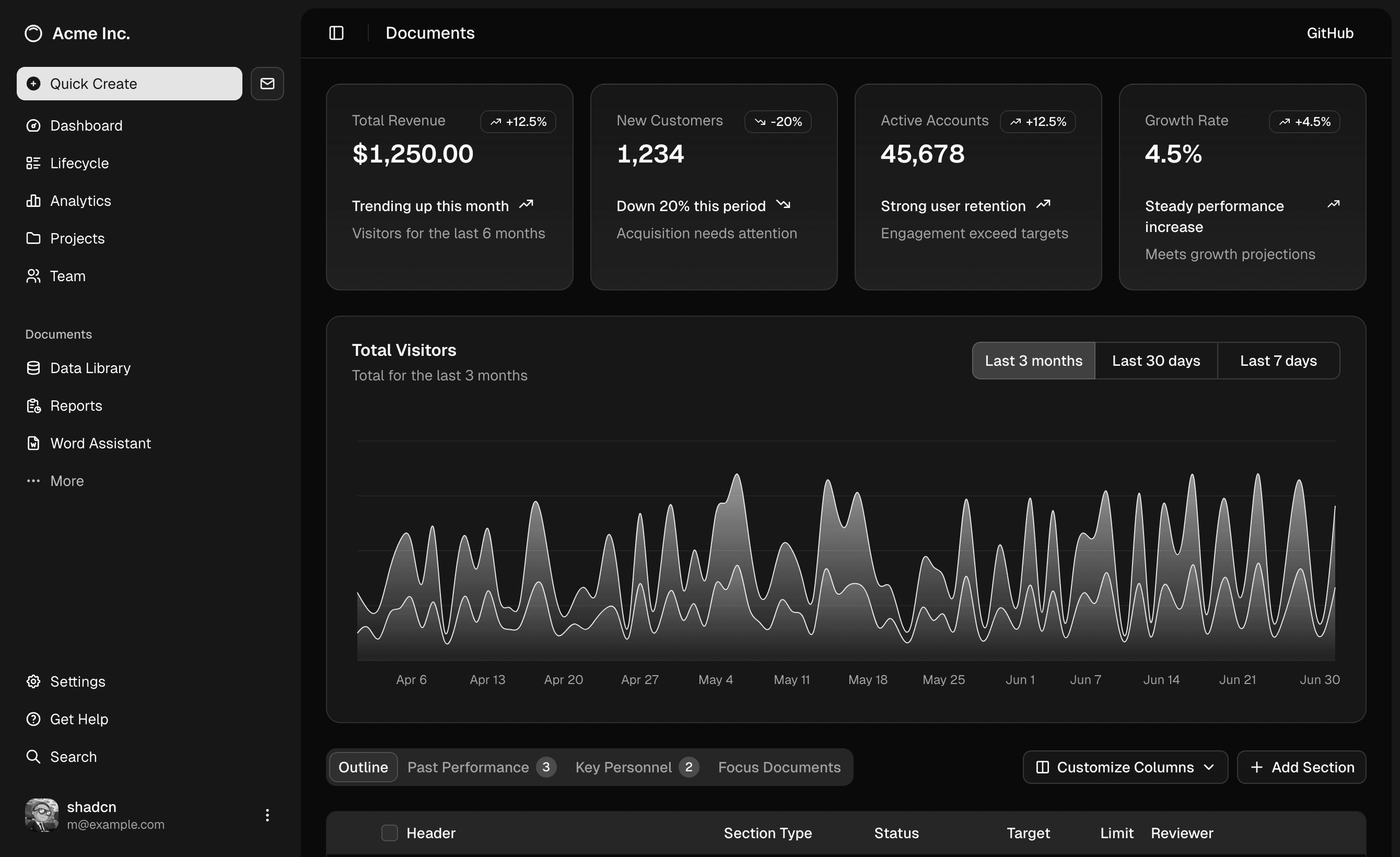
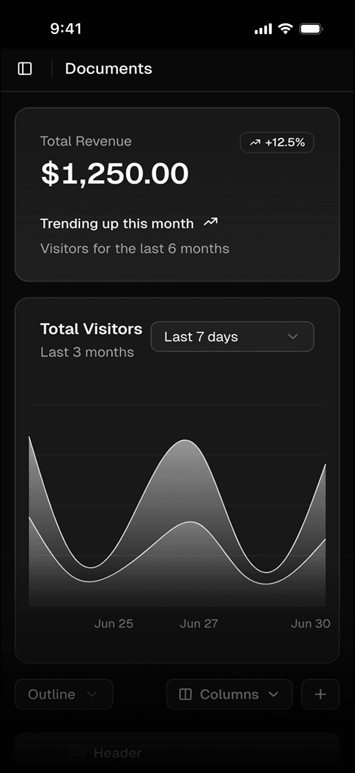
Sep 15 2025 12:34 PM
Changes committed and pushed
Cursor • contact@mikolajdobrucki.com
Pixel-perfect animated illustrations. Hand-crafted with HTML, SVG, CSS and React to fit Shadcn style and code practices.
Made for landing pages and marketing websites, perfect for illustrating advanced, technical and abstract concepts. Ideal for developers and designers looking to add engaging visual elements to their websites with minimal effort.
To get access to all the illustrations, purchase Launch UI Pro.
Get all-access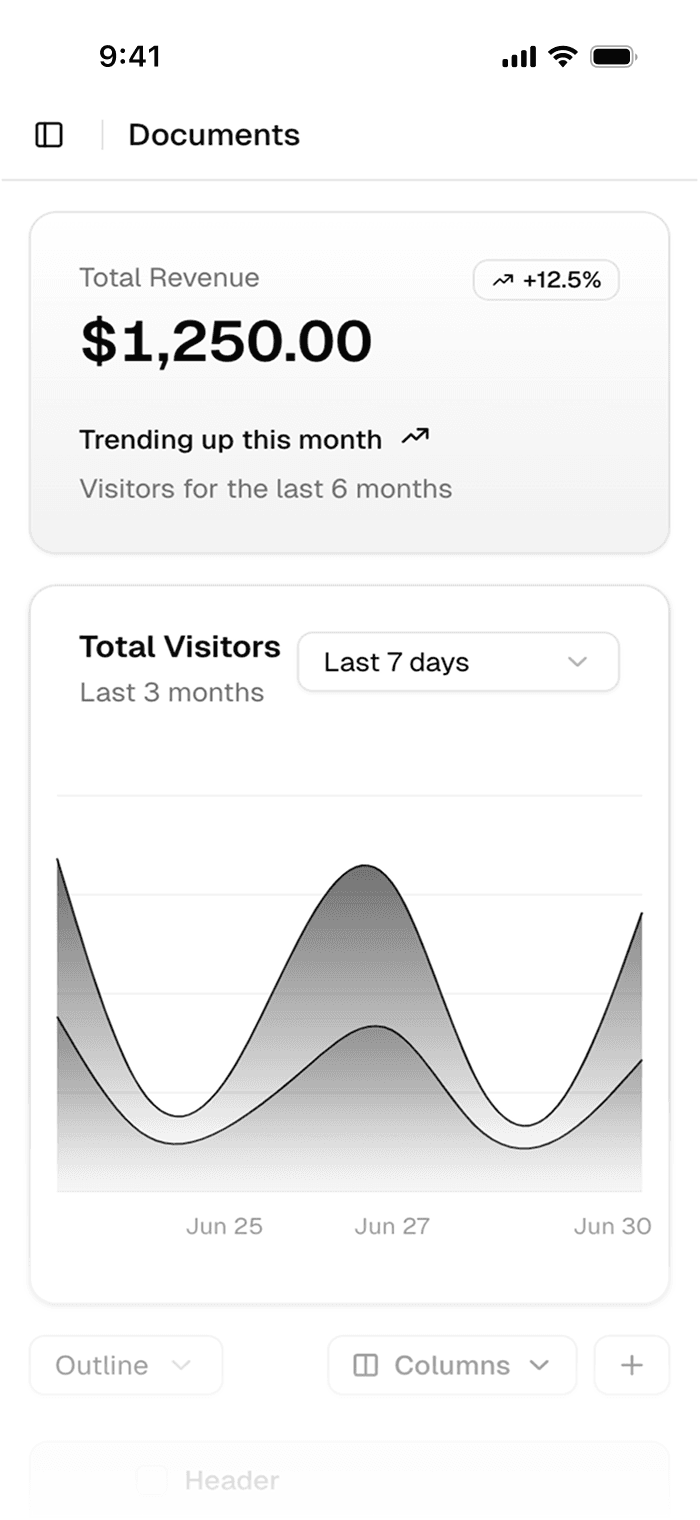
page.tsx
globals.css
import { cn } from "@/lib/utils";
import clsx from  "clsx";
import { PropsWithChildren } from "react";

type NoteProps = PropsWithChildren & {
 title?: string;
 type?: "note" | "danger" | "warning" | "success";
 className?: string;
 };

export default function Note({
 children,
 title = "Note",
 type = "note",
 className,
 }: NoteProps ) {
 const noteClassNames = clsx({
 "dark:bg-stone-950/25 bg-stone-50": type == "note",
 "dark:bg-red-950 bg-red-100 border-red-200 dark:border-red-900":
 type === "danger",
 "dark:bg-orange-950 bg-orange-100 border-orange-200 dark:border-orange-900":
 type === "warning",
 "dark:bg-green-950 bg-green-100 border-green-200 dark:border-green-900":
 type === "success",
  });
@import "tailwindcss";

@plugin "tailwindcss-animate";

@import "../styles/syntax.css" layer(utilities);
@import "../styles/theme.css" layer(utilities);

@custom-variant dark (&:where(.dark, .dark *));

@theme inline {
 --color-brand: var(--brand);
 --color-brand-foreground: var(--brand-foreground);
 --color-light: var(--light);
 --color-light-foreground: var(--light-foreground);
 --color-background: var(--background);
 --color-foreground: var(--foreground);
 --color-sidebar-ring: var(--sidebar-ring);
127.0.0.1:8000