Hero
A powerful hero section component built with shadcn/ui.
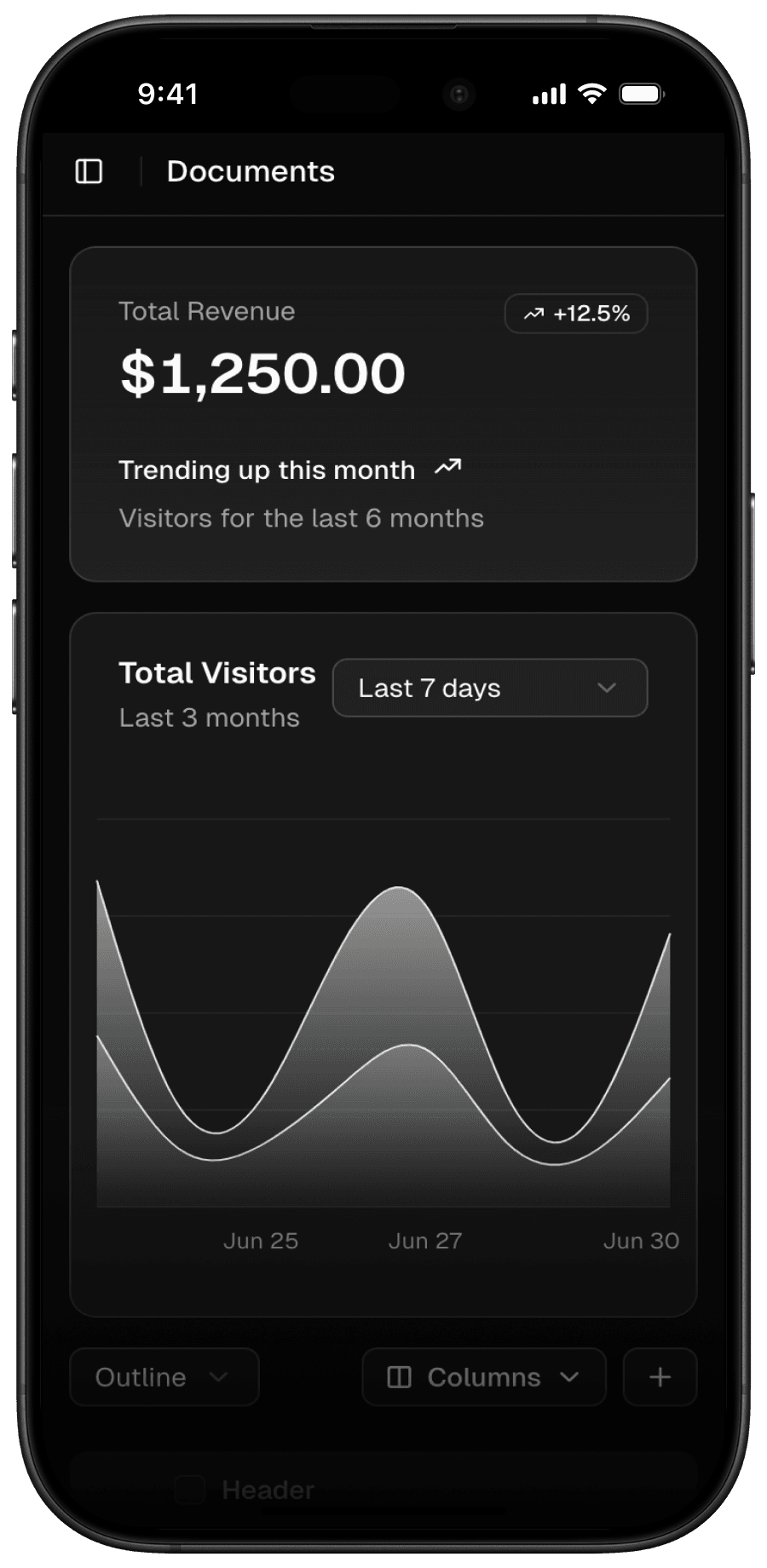
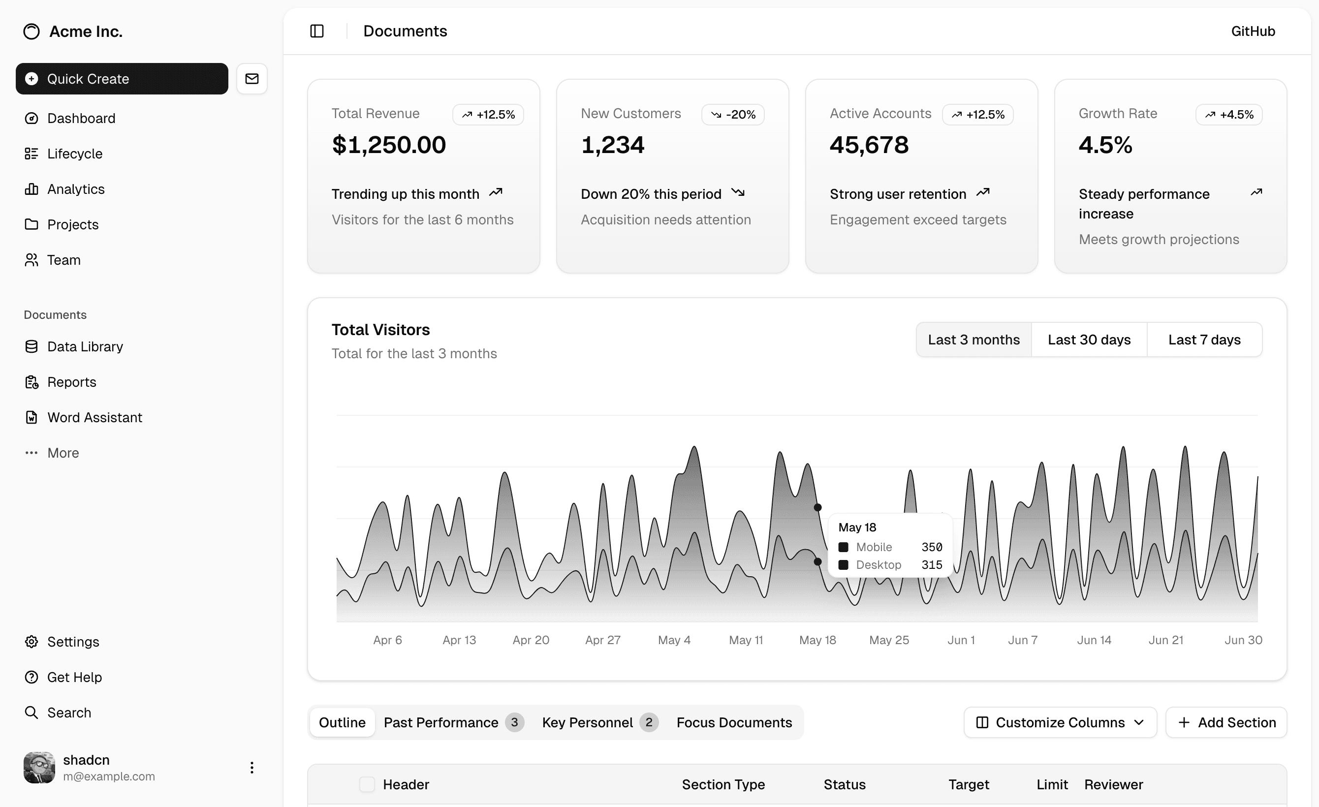
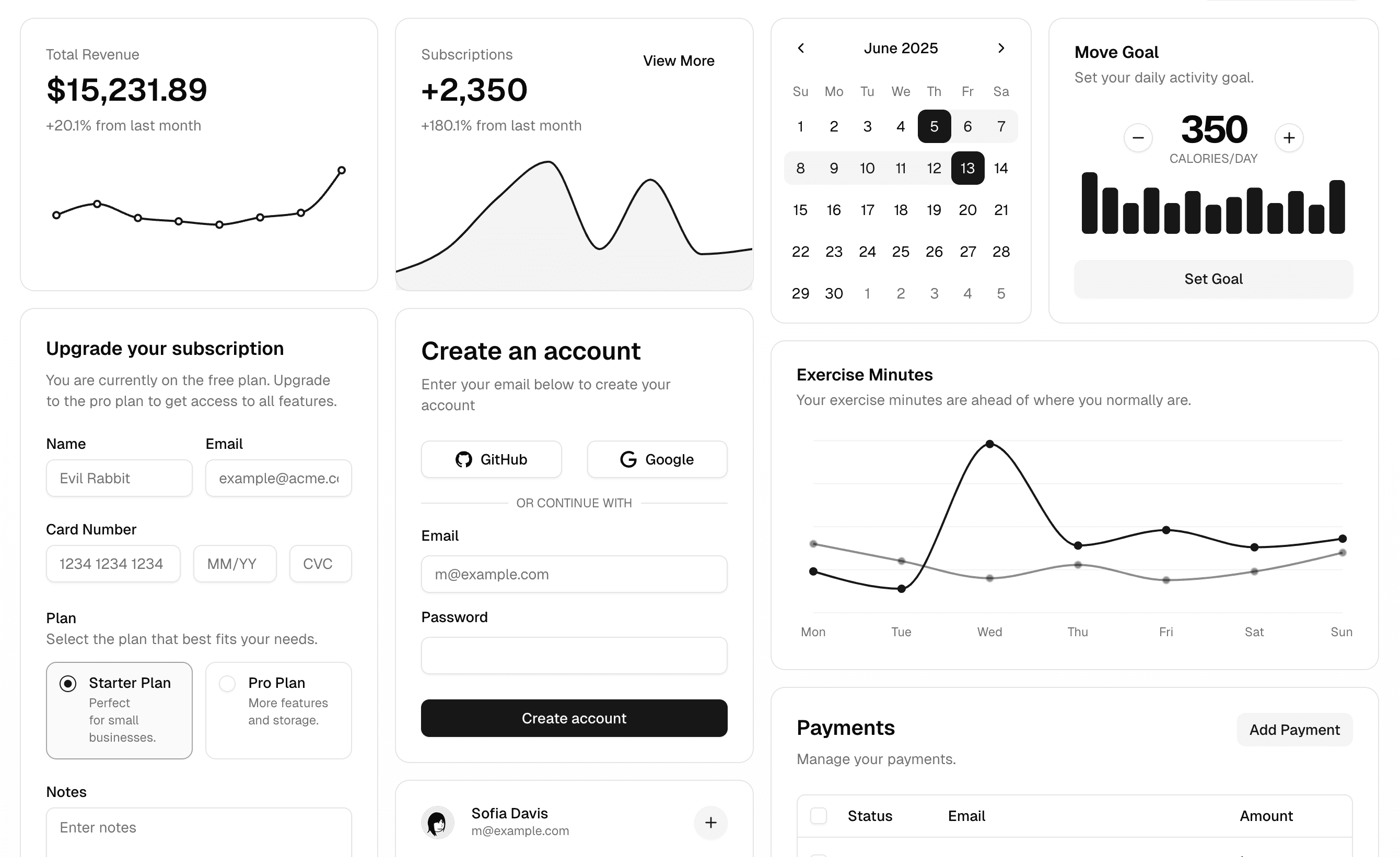
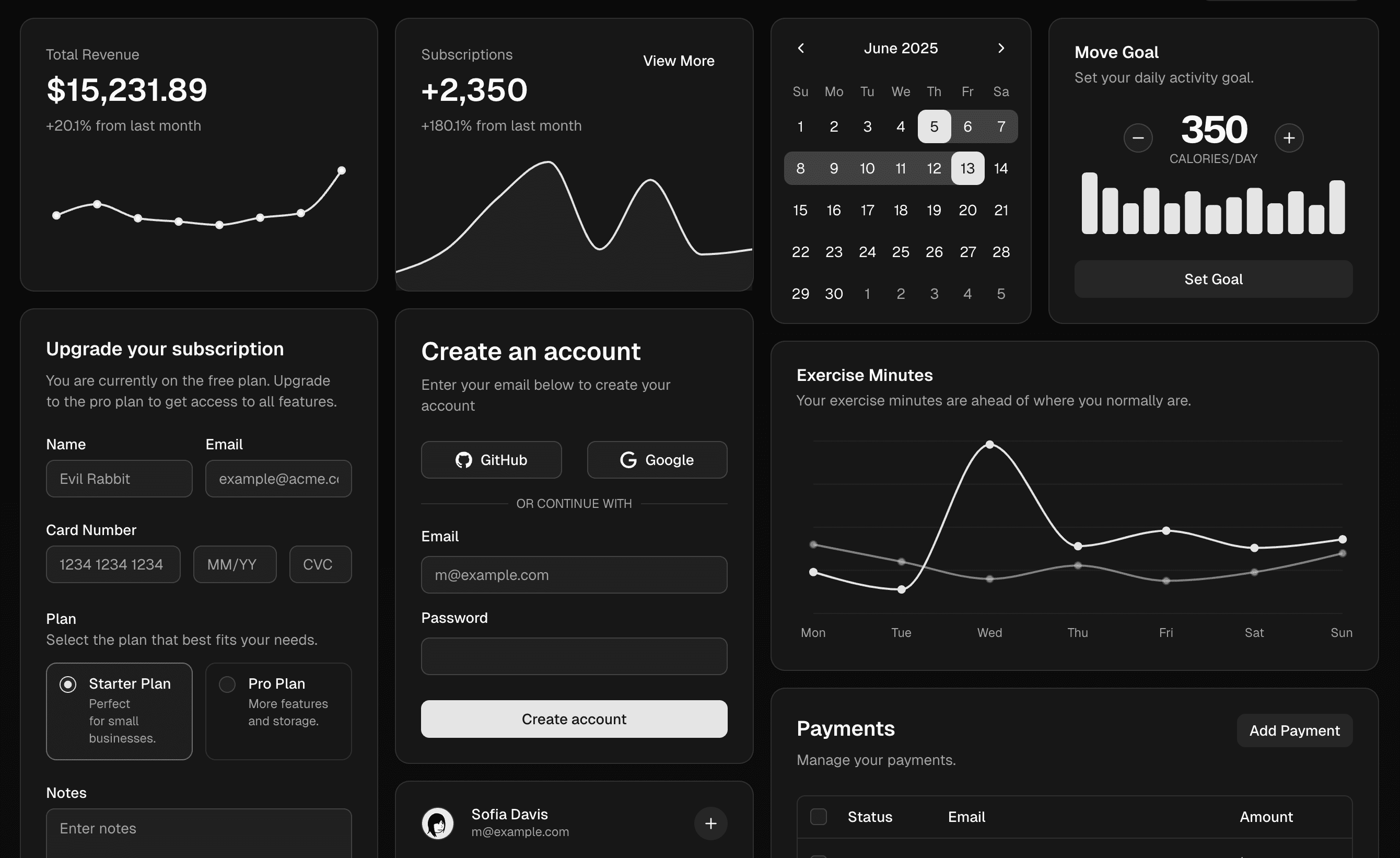
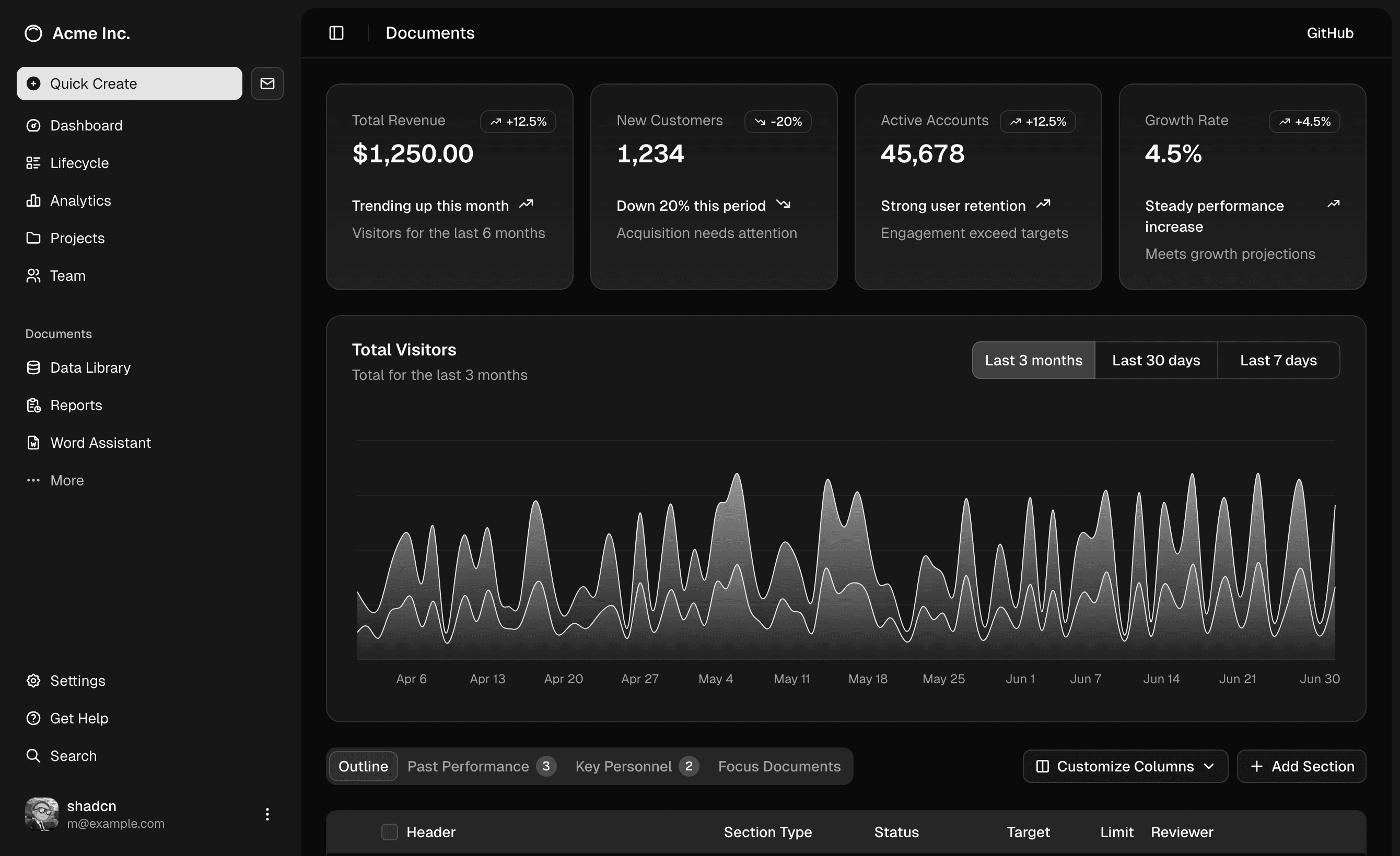
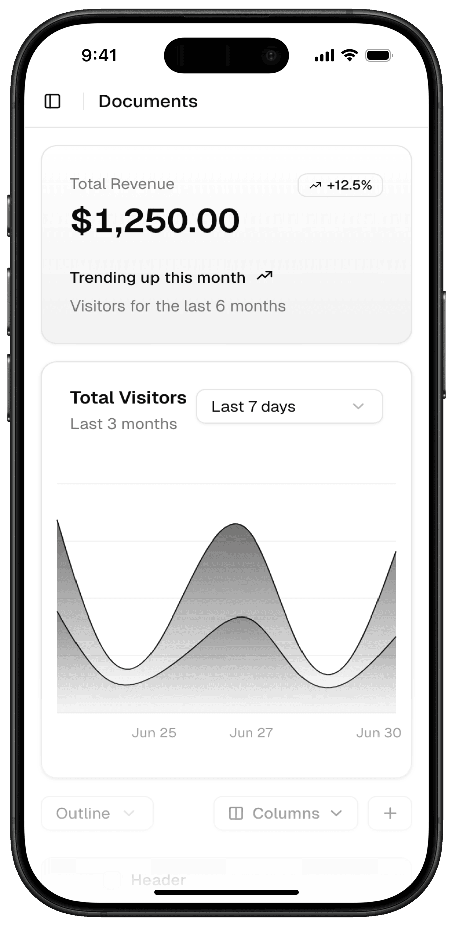
Create stunning hero sections with multiple variants including illustration-based layouts, glowing effects, and mobile app showcases. Each variant is designed to make a strong first impression while maintaining shadcn's signature aesthetic.
Built with Tailwind CSS, this component delivers pixel-perfect, responsive hero sections that adapt beautifully across all devices. The clean, modern design principles ensure your hero section effectively communicates your message while maintaining visual harmony with other shadcn components.
Installation
Set up project
If you haven't done that already, follow the installation guide before installing your first component.
Install components and dependencies
npx shadcn@latest add @launchui/hero
This command will:
- install necessary dependencies and add them to
package.json - add necessary components to
components/ui - add a ready-to-use block to
components/sections
Add more variants
Get Launch UI Pro to access all variants.
Usage
Give your big idea the design it deserves
Professionally designed blocks and templates built with React, Shadcn/ui and Tailwind that will help your product stand out.
Give your big idea the design it deserves
Professionally designed blocks and templates built with React, Shadcn/ui and Tailwind that will help your product stand out.

Give your big idea the design it deserves
Professionally designed blocks and templates built with React, Shadcn/ui and Tailwind that will help your product stand out.
Free and open source forever.
Give your big idea the design it deserves
Professionally designed blocks and templates built with React, Shadcn/ui and Tailwind that will help your product stand out.


Give your big idea the design it deserves
Professionally designed blocks and templates built with React, Shadcn/ui and Tailwind that will help your product stand out.
Need more variants?
Learn how to create more variants on your own.
Check out my free course designwithcode.dev
Need help?
File a feature request, report a bug, or ask me anything.
